Showing posts with label data science. Show all posts

Sunday, June 03, 2018

toolsmith #133 - Anomaly Detection & Threat Hunting with Anomalize

When, in October and November's toolsmith posts, I redefined DFIR under the premise of Deeper Functionality for Investigators in R, I discovered a "tip of the iceberg" scenario. To that end, I'd like to revisit the concept with an additional discovery and opportunity. In reality, this is really a case of DFIR (Deeper Functionality for Investigators in R) within the general practice of the original and paramount DFIR (Digital Forensics/Incident Response).
As discussed here before, those of us in the DFIR practice, and Blue Teaming at large, are overwhelmed by data and scale. Success truly requires algorithmic methods. If you're not already invested here I have an immediately applicable case study for you in tidy anomaly detection with anomalize.
First, let me give credit where entirely due for the work that follows. Everything I discuss and provide is immediately derivative from Business Science (@bizScienc), specifically Matt Dancho (@mdancho84). He created anomalize, "a tidy anomaly detection algorithm that’s time-based (built on top of tibbletime) and scalable from one to many time series," when a client asked Business Science to build an open source anomaly detection algorithm that suited their needs. I'd say he responded beautifully, when his blogpost hit my radar via R-Bloggers it lived as an open tab in my browser for more than a month until generating this toolsmith. Please consider Matt's post a mandatory read as step one of the process here. I'll quote Matt specifically before shifting context: "Our client had a challenging problem: detecting anomalies in time series on daily or weekly data at scale. Anomalies indicate exceptional events, which could be increased web traffic in the marketing domain or a malfunctioning server in the IT domain. Regardless, it’s important to flag these unusual occurrences to ensure the business is running smoothly. One of the challenges was that the client deals with not one time series but thousands that need to be analyzed for these extreme events."
Key takeaway: Detecting anomalies in time series on daily or weekly data at scale. Anomalies indicate exceptional events.
Now shift context with me to security-specific events and incidents, as the pertain to security monitoring, incident response, and threat hunting. In my November 2017 post, recall that I discussed Time Series Regression with the Holt-Winters method and a focus on seasonality and trends. Unfortunately, I couldn't share the code for how we applied TSR, but pointed out alternate methods, including Seasonal and Trend Decomposition using Loess (STL):
  • Handles any type of seasonality ~ can change over time
  • Smoothness of the trend-cycle can also be controlled by the user
  • Robust to outliers
Here now, Matt has created a means to immediately apply the STL method, along with the Twitter method (reference page), as part of his time_decompose() function, one of three functions specific to the anomalize package. In addition to time_decompose(), which separates the time series into seasonal, trend, and remainder components, anomalize includes:
  • anomalize(): Applies anomaly detection methods to the remainder component.
  • time_recompose(): Calculates limits that separate the “normal” data from the anomalies
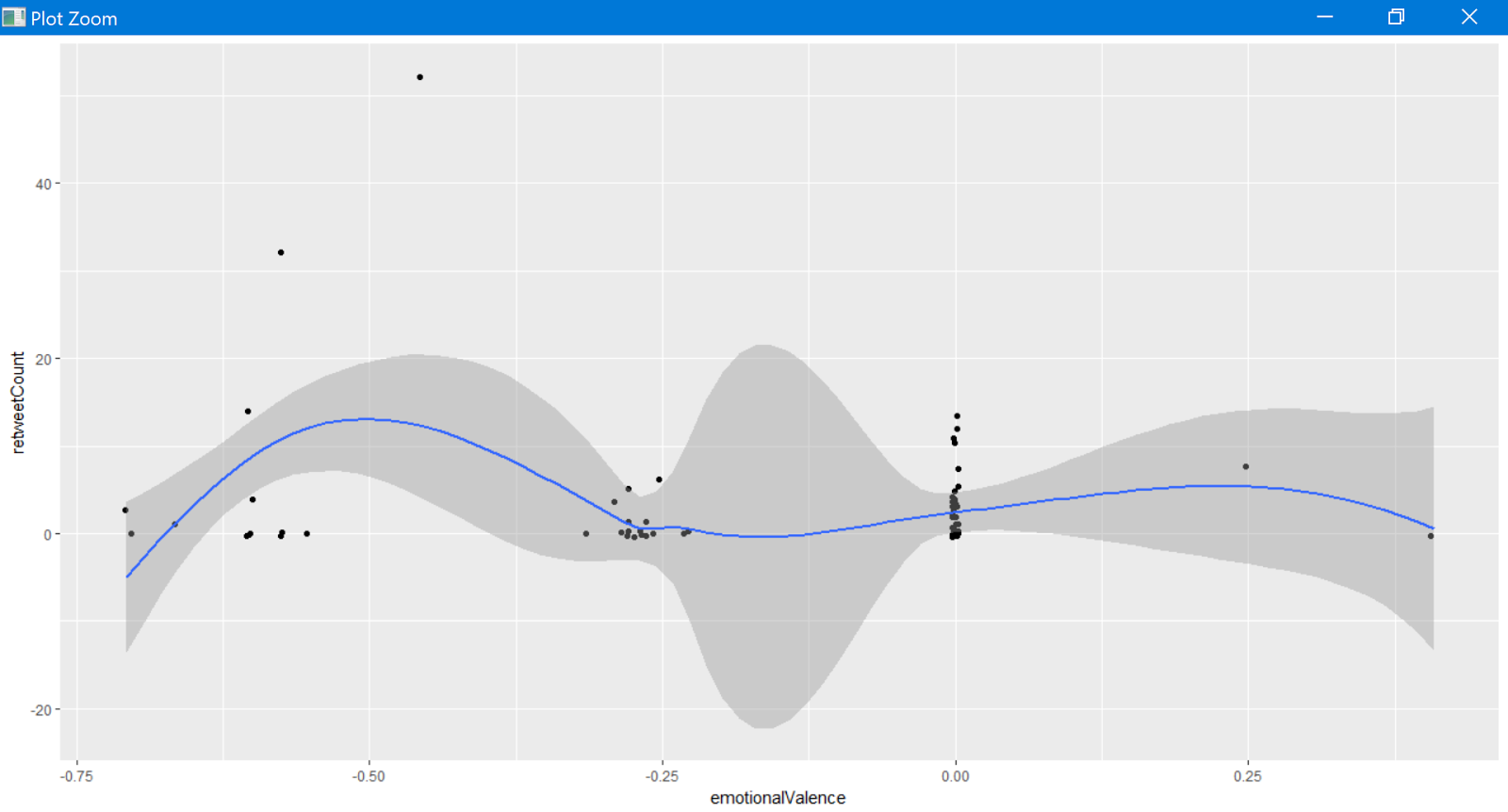
The methods used in anomalize(), including IQR and GESD are described in Matt's reference page. Matt ultimately set out to build a scalable adaptation of Twitter's AnomalyDetection package in order to address his client's challenges in dealing with not one time series but thousands needing to be analyzed for extreme events. You'll note that Matt describes anomalize using a dataset of the daily download counts of  the 15 tidyverse packages from CRAN, relevant as he leverages the tidyverse package. I initially toyed with tweaking Matt's demo to model downloads for security-specific R packages (yes, there are such things) from CRAN, including RAppArmor, net.security, securitytxt, and cymruservices, the latter two courtesy of Bob Rudis (@hrbrmstr) of our beloved Data-Driven Security: Analysis, Visualization and Dashboards. Alas, this was a mere rip and replace, and really didn't exhibit the use of anomalize in a deserving, varied, truly security-specific context. That said, I was able to generate immediate results doing so, as seen in Figure 1

Figure 1: Initial experiment
As an initial experiment you can replace packages names with those of your choosing in tidyverse_cran_downloads.R, run it in R Studio, then tweak variable names and labels in the code per Matt's README page.  
I wanted to run anomalize against a real security data scenario, so I went back to the dataset from the original DFIR articles where I'd utilized counts of 4624 Event IDs per day, per user, on a given set of servers. As utilized originally, I'd represented results specific to only one device and user, but herein is the beauty of anomalize. We can achieve quick results across multiple times series (multiple systems/users). This premise is but one of many where time series analysis and seasonality can be applied to security data.
I originally tried to write log data from log.csv straight to an anomalize.R script with logs = read_csv("log.csv") into a tibble (ready your troubles with tibbles jokes), which was not being parsed accurately, particularly time attributes. To correct this, from Matt's Github I grabbed tidyverse_cran_downloads.R, and modified it as follows:
This helped greatly thanks to the tibbletime package, which is "is an extension that allows for the creation of time aware tibbles. Some immediate advantages of this include: the ability to perform time based subsetting on tibbles, quickly summarising and aggregating results by time periods. Guess what, Matt wrote tibbletime too. :-)
I then followed Matt's sequence as he posted on Business Science, but with my logs defined as a function in Security_Access_Logs_Function.R. Following, I'll give you the code snippets, as revised from Matt's examples, followed by their respective results specific to processing my Event ID 4624 daily count log.
First, let's summarize daily login counts across three servers over four months.
The result is evident in Figure 2.

Figure 2: Server logon counts visualized
Next, let's determine which daily download logons are anomalous with Matt's three main functions, time_decompose(), anomalize(), and time_recompose(), along with the visualization function, plot_anomalies(), across the same three servers over four months.
The result is revealed in Figure 3.

Figure 3: Security event log anomalies
Following Matt's method using Twitter’s AnomalyDetection package, combining time_decompose(method = "twitter") with anomalize(method = "gesd"), while adjusting the trend = "4 months" to adjust median spans, we'll focus only on SERVER-549521.
In Figure 4, you'll note that there are anomalous logon counts on SERVER-549521 in June.
Figure 4: SERVER-549521 logon anomalies with Twitter & GESD methods
We can compare the Twitter (time_decompose) and GESD (anomalize) methods with the STL (time_decompose) and IQR (anomalize) methods, which use different decomposition and anomaly detection approaches.
Again, we note anomalies in June, as seen in Figure 5.
Figure 5: SERVER-549521 logon anomalies with STL & IQR methods
Obviously, the results are quite similar, as one would hope. Finally, let use Matt's plot_anomaly_decomposition() for visualizing the inner workings of how algorithm detects anomalies in the remainder for SERVER-549521.
The result is a four part visualization, including observed, season, trend, and remainder as seen in Figure 6.
Figure 6: Decomposition for SERVER-549521 Logins
I'm really looking forward to putting these methods to use at a much larger scale, across a far broader event log dataset. I firmly assert that blue teams are already way behind in combating automated adversary tactics and problems of sheer scale, so...much...data. It's only with tactics such as Matt's anomalize, and others of its ilk, that defenders can hope to succeed. Be sure the watch Matt's YouTube video on anomalize, Business Science is building a series of videos in addition, so keep an eye out there and on their GitHub for more great work that we can apply a blue team/defender's context to.
All the code snippets are in my GitHubGist here, and the sample log file, a single R script, and a Jupyter  Notebook are all available for you on my GitHub under toolsmith_r. I hope you find anomalize as exciting and useful as I have, great work by Matt, looking forward to see what's next from Business Science.
Cheers...until next time.

Sunday, November 19, 2017

toolsmith #129 - DFIR Redefined: Deeper Functionality for Investigators with R - Part 2

You can have data without information, but you cannot have information without data. ~Daniel Keys Moran

Here we resume our discussion of DFIR Redefined: Deeper Functionality for Investigators with R as begun in Part 1.
First, now that my presentation season has wrapped up, I've posted the related material on the Github for this content. I've specifically posted the most recent version as presented at SecureWorld Seattle, which included Eric Kapfhammer's contributions and a bit of his forward thinking for next steps in this approach.
When we left off last month I parted company with you in the middle of an explanation of analysis of emotional valence, or the "the intrinsic attractiveness (positive valence) or averseness (negative valence) of an event, object, or situation", using R and the Twitter API. It's probably worth your time to go back and refresh with the end of Part 1. Our last discussion point was specific to the popularity of negative tweets versus positive tweets with a cluster of emotionally neutral retweets, two positive retweets, and a load of negative retweets. This type of analysis can quickly give us better understanding of an attacker collective's sentiment, particularly where the collective is vocal via social media. Teeing off the popularity of negative versus positive sentiment, we can assess the actual words fueling such sentiment analysis. It doesn't take us much R code to achieve our goal using the apply family of functions. The likes of apply, lapply, and sapply allow you to manipulate slices of data from matrices, arrays, lists and data frames in a repetitive way without having to use loops. We use code here directly from Michael Levy, Social Scientist, and his Playing with Twitter Data post.

polWordTables = 
  sapply(pol, function(p) {
    words = c(positiveWords = paste(p[[1]]$pos.words[[1]], collapse = ' '), 
              negativeWords = paste(p[[1]]$neg.words[[1]], collapse = ' '))
    gsub('-', '', words)  # Get rid of nothing found's "-"
  }) %>%
  apply(1, paste, collapse = ' ') %>% 
  stripWhitespace() %>% 
  strsplit(' ') %>%
  sapply(table)

par(mfrow = c(1, 2))
invisible(
  lapply(1:2, function(i) {
    dotchart(sort(polWordTables[[i]]), cex = .5)
    mtext(names(polWordTables)[i])
  }))

The result is a tidy visual representation of exactly what we learned at the end of Part 1, results as noted in Figure 1.

Figure 1: Positive vs negative words
Content including words such as killed, dangerous, infected, and attacks are definitely more interesting to readers than words such as good and clean. Sentiment like this could definitely be used to assess potential attacker outcomes and behaviors just prior, or in the midst of an attack, particularly in DDoS scenarios. Couple sentiment analysis with the ability to visualize networks of retweets and mentions, and you could zoom in on potential leaders or organizers. The larger the network node, the more retweets, as seen in Figure 2.

Figure 2: Who is retweeting who?
Remember our initial premise, as described in Part 1, was that attacker groups often use associated hashtags and handles, and the minions that want to be "part of" often retweet and use the hashtag(s). Individual attackers either freely give themselves away, or often become easily identifiable or associated, via Twitter. Note that our dominant retweets are for @joe4security, @HackRead,  @defendmalware (not actual attackers, but bloggers talking about attacks, used here for example's sake). Figure 3 shows us who is mentioning who.

Figure 3: Who is mentioning who?
Note that @defendmalware mentions @HackRead. If these were actual attackers it would not be unreasonable to imagine a possible relationship between Twitter accounts that are actively retweeting and mentioning each other before or during an attack. Now let's assume @HackRead might be a possible suspect and you'd like to learn a bit more about possible additional suspects. In reality @HackRead HQ is in Milan, Italy. Perhaps Milan then might be a location for other attackers. I can feed  in Twittter handles from my retweet and mentions network above, query the Twitter API with very specific geocode, and lock it within five miles of the center of Milan.
The results are immediate per Figure 4.

Figure 4: GeoLocation code and results
Obviously, as these Twitter accounts aren't actual attackers, their retweets aren't actually pertinent to our presumed attack scenario, but they definitely retweeted @computerweekly (seen in retweets and mentions) from within five miles of the center of Milan. If @HackRead were the leader of an organization, and we believed that associates were assumed to be within geographical proximity, geolocation via the Twitter API could be quite useful. Again, these are all used as thematic examples, no actual attacks should be related to any of these accounts in any way.

Fast Frugal Trees (decision trees) for prioritizing criticality

With the abundance of data, and often subjective or biased analysis, there are occasions where a quick, authoritative decision can be quite beneficial. Fast-and-frugal trees (FFTs) to the rescue. FFTs are simple algorithms that facilitate efficient and accurate decisions based on limited information.
Nathaniel D. Phillips, PhD created FFTrees for R to allow anyone to easily create, visualize and evaluate FFTs. Malcolm Gladwell has said that "we are suspicious of rapid cognition. We live in a world that assumes that the quality of a decision is directly related to the time and effort that went into making it.” FFTs, and decision trees at large, counter that premise and aid in the timely, efficient processing of data with the intent of a quick but sound decision. As with so much of information security, there is often a direct correlation with medical, psychological, and social sciences, and the use of FFTs is no different. Often, predictive analysis is conducted with logistic regression, used to "describe data and to explain the relationship between one dependent binary variable and one or more nominal, ordinal, interval or ratio-level independent variables." Would you prefer logistic regression or FFTs?

Figure 5: Thanks, I'll take FFTs
Here's a text book information security scenario, often rife with subjectivity and bias. After a breach, and subsequent third party risk assessment that generated a ton of CVSS data, make a fast decision about what treatments to apply first. Because everyone loves CVSS.

Figure 6: CVSS meh
Nothing like a massive table, scored by base, impact, exploitability, temporal, environmental, modified impact, and overall scores, all assessed by a third party assessor who may not fully understand the complexities or nuances of your environment. Let's say our esteemed assessor has decided that there are 683 total findings, of which 444 are non-critical and 239 are critical. Will FFTrees agree? Nay! First, a wee bit of R code.

library("FFTrees")
cvss <- c:="" coding="" csv="" p="" r="" read.csv="" rees="">cvss.fft <- data="cvss)</p" fftrees="" formula="critical">plot(cvss.fft, what = "cues")
plot(cvss.fft,
     main = "CVSS FFT",
     decision.names = c("Non-Critical", "Critical"))


Guess what, the model landed right on impact and exploitability as the most important inputs, and not just because it's logically so, but because of their position when assessed for where they fall in the area under the curve (AUC), where the specific curve is the receiver operating characteristic (ROC). The ROC is a "graphical plot that illustrates the diagnostic ability of a binary classifier system as its discrimination threshold is varied." As for the AUC, accuracy is measured by the area under the ROC curve where an area of 1 represents a perfect test and an area of .5 represents a worthless test. Simply, the closer to 1, the better. For this model and data, impact and exploitability are the most accurate as seen in Figure 7.

Figure 7: Cue rankings prefer impact and exploitability
The fast and frugal tree made its decision where impact and exploitability with scores equal or less than 2 were non-critical and exploitability greater than 2 was labeled critical, as seen in Figure 8.

Figure 8: The FFT decides
Ah hah! Our FFT sees things differently than our assessor. With a 93% average for performance fitting (this is good), our tree, making decisions on impact and exploitability, decides that there are 444 non-critical findings and 222 critical findings, a 17 point differential from our assessor. Can we all agree that mitigating and remediating critical findings can be an expensive proposition? If you, with just a modicum of data science, can make an authoritative decision that saves you time and money without adversely impacting your security posture, would you count it as a win? Yes, that was rhetorical.

Note that the FFTrees function automatically builds several versions of the same general tree that make different error trade-offs with variations in performance fitting and false positives. This gives you the option to test variables and make potentially even more informed decisions within the construct of one model. Ultimately, fast frugal trees make very fast decisions on 1 to 5 pieces of information and ignore all other information. In other words, "FFTrees are noncompensatory, once they make a decision based on a few pieces of information, no additional information changes the decision."

Finally, let's take a look at monitoring user logon anomalies in high volume environments with Time Series Regression (TSR). Much of this work comes courtesy of Eric Kapfhammer, our lead data scientist on our Microsoft Windows and Devices Group Blue Team. The ideal Windows Event ID for such activity is clearly 4624: an account was successfully logged on. This event is typically one of the top 5 events in terms of volume in most environments, and has multiple type codes including Network, Service, and RemoteInteractive.
User accounts will begin to show patterns over time, in aggregate, including:
  • Seasonality: day of week, patch cycles, 
  • Trend: volume of logons increasing/decreasing over time
  • Noise: randomness
You could look at 4624 with a Z-score model, which sets a threshold based on the number of standard deviations away from an average count over a given period of time, but this is a fairly simple model. The higher the value, the greater the degree of “anomalousness”.
Preferably, via Time Series Regression (TSR), your feature set is more rich:
  • Statistical method for predicting a future response based on the response history (known as autoregressive dynamics) and the transfer of dynamics from relevant predictors
  • Understand and predict the behavior of dynamic systems from experimental or observational data
  • Commonly used for modeling and forecasting of economic, financial and biological systems
How to spot the anomaly in a sea of logon data?
Let's imagine our user, DARPA-549521, in the SUPERSECURE domain, with 90 days of aggregate 4624 Type 10 events by day.

Figure 9: User logon data
With 210 line of R, including comments, log read, file output, and graphing we can visualize and alert on DARPA-549521's data as seen in Figure 10

Figure 10: User behavior outside the confidence interval
We can detect when a user’s account exhibits  changes in their seasonality as it relates to a confidence interval established (learned) over time. In this case, on 27 AUG 2017, the user topped her threshold of 19 logons thus triggering an exception. Now imagine using this model to spot anomalous user behavior across all users and you get a good feel for the model's power.
Eric points out that there are, of course, additional options for modeling including:
  • Seasonal and Trend Decomposition using Loess (STL)
    • Handles any type of seasonality ~ can change over time
    • Smoothness of the trend-cycle can also be controlled by the user
    • Robust to outliers
  • Classification and Regression Trees (CART)
    • Supervised learning approach: teach trees to classify anomaly / non-anomaly
    • Unsupervised learning approach: focus on top-day hold-out and error check
  • Neural Networks
    • LSTM / Multiple time series in combination
These are powerful next steps in your capabilities, I want you to be brave, be creative, go forth and add elements of data science and visualization to your practice. R and Python are well supported and broadly used for this mission and can definitely help you detect attackers faster, contain incidents more rapidly, and enhance your in-house detection and remediation mechanisms.
All the code as I can share is here; sorry, I can only share the TSR example without the source.
All the best in your endeavors!
Cheers...until next time.

Tuesday, October 17, 2017

toolsmith #128 - DFIR Redefined: Deeper Functionality for Investigators with R - Part 1

“To competently perform rectifying security service, two critical incident response elements are necessary: information and organization.” ~ Robert E. Davis

I've been presenting DFIR Redefined: Deeper Functionality for Investigators with R across the country at various conference venues and thought it would helpful to provide details for readers.
The basic premise?
Incident responders and investigators need all the help they can get.
Let me lay just a few statistics on you, from Secure360.org's The Challenges of Incident Response, Nov 2016. Per their respondents in a survey of security professionals:
  • 38% reported an increase in the number of hours devoted to incident response
  • 42% reported an increase in the volume of incident response data collected
  • 39% indicated an increase in the volume of security alerts
In short, according to Nathan Burke, “It’s just not mathematically possible for companies to hire a large enough staff to investigate tens of thousands of alerts per month, nor would it make sense.”
The 2017 SANS Incident Response Survey, compiled by Matt Bromiley in June, reminds us that “2016 brought unprecedented events that impacted the cyber security industry, including a myriad of events that raised issues with multiple nation-state attackers, a tumultuous election and numerous government investigations.” Further, "seemingly continuous leaks and data dumps brought new concerns about malware, privacy and government overreach to the surface.”
Finally, the survey shows that IR teams are:
  • Detecting the attackers faster than before, with a drastic improvement in dwell time
  • Containing incidents more rapidly
  • Relying more on in-house detection and remediation mechanisms
To that end, what concepts and methods further enable handlers and investigators as they continue to strive for faster detection and containment? Data science and visualization sure can’t hurt. How can we be more creative to achieve “deeper functionality”? I propose a two-part series on Deeper Functionality for Investigators with R with the following DFIR Redefined scenarios:
  • Have you been pwned?
  • Visualization for malicious Windows Event Id sequences
  • How do your potential attackers feel, or can you identify an attacker via sentiment analysis?
  • Fast Frugal Trees (decision trees) for prioritizing criticality
R is “100% focused and built for statistical data analysis and visualization” and “makes it remarkably simple to run extensive statistical analysis on your data and then generate informative and appealing visualizations with just a few lines of code.”

With R you can interface with data via file ingestion, database connection, APIs and benefit from a wide range of packages and strong community investment.
From the Win-Vector Blog, per John Mount “not all R users consider themselves to be expert programmers (many are happy calling themselves analysts). R is often used in collaborative projects where there are varying levels of programming expertise.”
I propose that this represents the vast majority of us, we're not expert programmers, data scientists, or statisticians. More likely, we're security analysts re-using code for our own purposes, be it red team or blue team. With a very few lines of R investigators might be more quickly able to reach conclusions.
All the code described in the post can be found on my GitHub.

Have you been pwned?

This scenario I covered in an earlier post, I'll refer you to Toolsmith Release Advisory: Steph Locke's HIBPwned R package.

Visualization for malicious Windows Event Id sequences

Windows Events by Event ID present excellent sequenced visualization opportunities. A hypothetical scenario for this visualization might include multiple failed logon attempts (4625) followed by a successful logon (4624), then various malicious sequences. A fantastic reference paper built on these principle is Intrusion Detection Using Indicators of Compromise Based on Best Practices and Windows Event Logs. An additional opportunity for such sequence visualization includes Windows processes by parent/children. One R library particularly well suited to is TraMineR: Trajectory Miner for R. This package is for mining, describing and visualizing sequences of states or events, and more generally discrete sequence data. It's primary aim is the analysis of biographical longitudinal data in the social sciences, such as data describing careers or family trajectories, and a BUNCH of other categorical sequence data. Somehow though, the project page somehow fails to mention malicious Windows Event ID sequences. :-) Consider Figures 1 and 2 as retrieved from above mentioned paper. Figure 1 are text sequence descriptions, followed by their related Windows Event IDs in Figure 2.

Figure 1
Figure 2
Taking related log data, parsing and counting it for visualization with R would look something like Figure 3.

Figure 3
How much R code does it take to visualize this data with a beautiful, interactive sunburst visualization? Three lines, not counting white space and comments, as seen in the video below.


A screen capture of the resulting sunburst also follows as Figure 4.

Figure 4


How do your potential attackers feel, or can you identify an attacker via sentiment analysis?

Do certain adversaries or adversarial communities use social media? Yes
As such, can social media serve as an early warning system, if not an actual sensor? Yes
Are certain adversaries, at times, so unaware of OpSec on social media that you can actually locate them or correlate against other geo data? Yes
Some excellent R code to assess Twitter data with includes Jeff Gentry's twitteR and rtweet to interface with the Twitter API.
  • twitteR: provides access to the Twitter API. Most functionality of the API is supported, with a bias towards API calls that are more useful in data analysis as opposed to daily interaction.
  • Rtweet: R client for interacting with Twitter’s REST and stream API’s.
The code and concepts here are drawn directly from Michael Levy, PhD UC Davis: Playing With Twitter.
Here's the scenario: DDoS attacks from hacktivist or chaos groups.
Attacker groups often use associated hashtags and handles and the minions that want to be "part of" often retweet and use the hashtag(s). Individual attackers either freely give themselves away, or often become easily identifiable or associated, via Twitter. As such, here's a walk-through of analysis techniques that may help identify or better understand the motives of certain adversaries and adversary groups. I don't use actual adversary handles here, for obvious reasons. I instead used a DDoS news cycle and journalist/bloggers handles as exemplars. For this example I followed the trail of the WireX botnet, comprised mainly of Android mobile devices utilized to launch a high-impact DDoS extortion campaign against multiple organizations in the travel and hospitality sector in August 2017. I started with three related hashtags: 
  1. #DDOS 
  2. #Android 
  3. #WireX
We start with all related Tweets by day and time of day. The code is succinct and efficient, as noted in Figure 5.

Figure 5
The result is a pair of graphs color coded by tweets and retweets per Figure 6.

Figure 6

This gives you an immediate feels for spikes in interest by day as well as time of day, particularly with attention to retweets.
Want to see what platforms potential adversaries might be tweeting from? No problem, code in Figure 7.
Figure 7

The result in the scenario ironically indicates that the majority of related tweets using our hashtags of interest are coming from Androids per Figure 8. :-)


Figure 8
Now to the analysis of emotional valence, or the "the intrinsic attractiveness (positive valence) or averseness (negative valence) of an event, object, or situation."
orig$text[which.max(orig$emotionalValence)] tells us that the most positive tweet is "A bunch of Internet tech companies had to work together to clean up #WireX #Android #DDoS #botnet."
orig$text[which.min(orig$emotionalValence)] tells us that "Dangerous #WireX #Android #DDoS #Botnet Killed by #SecurityGiants" is the most negative tweet.
Interesting right? Almost exactly the same message, but very different valence.
How do we measure emotional valence changes over the day? Four lines later...
filter(orig, mday(created) == 29) %>%
  ggplot(aes(created, emotionalValence)) +
  geom_point() + 
  geom_smooth(span = .5)
...and we have Figure 9, which tell us that most tweets about WireX were emotionally neutral on 29 AUG 2017, around 0800 we saw one positive tweet, a more negative tweets overall in the morning.

Figure 9
Another line of questioning to consider: which tweets are more often retweeted, positive or negative? As you can imagine with information security focused topics, negativity wins the day.
Three lines of R...
ggplot(orig, aes(x = emotionalValence, y = retweetCount)) +
  geom_point(position = 'jitter') +
  geom_smooth()
...and we learn just how popular negative tweets are in Figure 10.

Figure 10
There are cluster of emotionally neutral retweets, two positive retweets, and a load of negative retweets. This type of analysis can quickly lead to a good feel for the overall sentiment of an attacker collective, particularly one with less opsec and more desire for attention via social media.
In Part 2 of DFIR Redefined: Deeper Functionality for Investigators with R we'll explore this scenario further via sentiment analysis and Twitter data, as well as Fast Frugal Trees (decision trees) for prioritizing criticality.
Let me know if you have any questions on the first part of this series via @holisticinfosec or russ at holisticinfosec dot org.
Cheers...until next time. 

Monday, September 01, 2014

toolsmith - Jay and Bob Strike Back: Data-Driven Security


Prerequisites
Data-Driven Security: Analysis, Visualization and Dashboards
R and RStudio as we’ll only focus on the R side of the discussion
All other dependencies for full interactive use of the book’s content are found in Tools You Will Need in the books Introduction.


Introduction
When last I referred you to a book as a tool we discussed TJ O’Connor’s Violent Python. I’ve since been knee deep in learning R and quickly discovered Data-Driven Security: Analysis, Visualization and Dashboards from Jay Jacobs and Bob Rudis, hereafter referred to a Jay and Bob (no, not these guys).

Jay and Silent Bob Strike Back :-)
Just so you know whose company you’re actually keeping here Jay is a coauthor of Verizon Data Breach Investigation Reports and Bob Rudis was named one of the Top 25 Influencers in Information Security by Tripwire.
I was looking to make quick use of R as specific to my threat intelligence & engineering practice as it so capably helps make sense of excessive and oft confusing data. I will not torment you with another flagrant misuse of big data vendor marketing spew; yes, data is big, we get it, enough already. Thank goodness, the Internet of Things (IoT) is now the most abused, overhyped FUD-fest term. Yet, the reality is, when dealing with a lot of data, tools such as R and Python are indispensable particularly when trying to quantify the data and make sense of it. Most of you are likely familiar with Python but if you haven’t heard of R, it’s a scripting language for statistical data manipulation and analysis. There are a number of excellent books on R, but nowhere will you find a useful blending of R and Python to directly support your information security analysis practice as seen in Jay and Bob’s book. I pinged Jay and Bob for their perspective and Bob provided optimally:
“Believe it or not, we (and our readers) actually have ZeroAccess to thank for the existence of Data-Driven Security (the book, blog and podcast). We started collaborating on security data analysis & visualization projects just about a year before we began writing the book, and one of the more engaging efforts was when we went from a boatload of ZeroAccess latitude & longitude pairs (and only those pairs) to maps, statistics and even graph analyses. We kept getting feedback (both from observation and direct interaction) that there was a real lack of practical data analysis & visualization materials out there for security practitioners and the domain-specific, vendor-provided tools were and are still quite lacking. It was our hope that we could help significantly enhance the capabilities and effectiveness of organizations by producing a security-centric guide to using modern, vendor-agnostic tools for analytics, a basic introduction to statistics and machine learning, the science behind effective visual communications and a look at how to build a great security data science team.
One area we discussed in the book, but is worth expanding on is how essential it is for information security professionals to get plugged-in to the broader "data science" community. Watching "breaker-oriented" RSS feeds/channels is great, but it's equally as important to see what other disciplines are successfully using to gain new insights into tough problems and regularly tap into the wealth of detailed advice on how to communicate your messages as effectively as possible. There's no need to reinvent the wheel or use yesterday's techniques when trying to stop tomorrow's threats.”
Well said, I’m a major advocate for the premise of moving threat intelligence beyond data brokering as Bob mentions. This books endeavors and provides the means with which to conduct security data science. According to Booz Allen’s The Field Guide to Data Science, “data science is a team sport.” While I’m biased, nowhere is that more true than the information security field. As you embark on the journey Data-Driven Security: Analysis, Visualization and Dashboards (referred to hereafter as DDSecBook) intends to take you on you’ll be provided with direction on all the tools you need, so we’ll not spend much time there and instead focus on the applied use of this rich content. I will be focusing solely on the R side of the discussion though as that is an area of heavy focus for me at present.  DDSecBook is described with the byline Uncover hidden patterns of data and respond with countermeasures. Awesome, let’s do just that.

Data-Driven Security

DDSecBook is laid out in such a manner as to allow even those with only basic coding or scripting (like me; I am the quintessential R script kiddie) to follow along and grow while reading and experimenting:
1.       The Journey to Data-Driven Security
2.       Building Your Analytics Toolbox: A Primer on Using R and Python for Security Analysis
3.       Learning the “Hello World” of Security Data Analysis
4.       Performing Exploratory Security Data Analysis
5.       From Maps to Regression
6.       Visualizing Security Data
7.       Learning from Security Breaches
8.       Breaking Up with Your Relational Database
9.       Demystifying Machine Learning
10.   Designing Effective Security Dashboards
11.   Building Interactive Security Visualizations
12.   Moving Toward Data-Driven Security

For demonstrative purposes of making quick use of the capabilities described, I’ll focus our attention on chapters 4 and 6. As a longtime visualization practitioner I nearly flipped out when I realized what I’d been missing in R, so chapters 4 and 6 struck close to home for me. DDSecBook includes code downloads for each chapter and the related data so you can and should play along as you read. Additionally, just to keep things timely and relevant, I’ll apply some of the techniques described in DDSecBook to current data of interest to me so you can see how repeatable and useful these methods really are.

Performing Exploratory Security Data Analysis

Before you make use of DDSecBook, if you’re unfamiliar with R, you should read An Introduction to R, Notes on R: A Programming Environment for DataAnalysis and Graphics and run through Appendix A. This will provide at least an inkling of the power at your fingertips.
This chapter introduces concepts specific to dissecting IP addresses including their representation, conversion to and from 32-bit integers, segmenting, grouping, and locating, all of which leads to augmenting IP address data with the likes of IANA data. This is invaluable when reviewing datasets such as the AlienVault reputation data, mentioned at length in Chapter 3, and available as updated hourly.
We’ll jump ahead here to Visualizing Your Firewall Data (Listing 4-16) as it provides a great example of taking methods described in the book and applying it immediately to your data. I’m going to set you up for instant success but you will have to work for it a bit. The script we’re about to discuss takes a number of dependencies created earlier in the chapter; I’ll meet them in the script for you (you can download it from my site), but only if you promise to buy this book and work though all prior exercises for yourself. Trust me, it’s well worth it. Here’s the primary snippet of the script, starting at line 293 after all the dependencies are met. What I’ve changed most importantly is the ability to measure an IP list against the very latest AlienVault reputation data. Note, I found a bit of a bug here that you’ll need to update per the DDSecBook blog. This is otherwise all taken directly ch04.r in the code download with specific attention to Listing 4-16 as seen in Figure 2.

FIGURE 2: R code to match bad IPs to AlienVault reputation data
I’ve color coded each section to give you a quick walk-through of what’s happening.
1)      Defines the URL from which to download the AlienVault reputation data and provides a specific destination to download it to.
2)      Reads in the AlienVault reputation data, creates a data frame from the data and provides appropriate column names. If you wanted to read the top of that data from the data frame, using head(av.df, 10) would result in Figure 3.

FIGURE 3: The top ten entries in the Alien Vault data frame
3)      Reads in the list of destination IP addresses, from a firewall log list as an example, and compares it against matches on the reliability column from the AlienVault reputation data.
4)      Reduces the dataset down to only matches for reliability above a rating of 6 as lower tends to be noise and of less value.
5)      Produces a graph with the graph.cc function created earlier in the ch04.r code listing.
The results are seen in Figure 4 where I mapped against the Alien Vault reputation data provided with the chapter 4 download versus brand new AlienVault data as of 25 AUG 2014.

FIGURE 4: Bad IPs mapped against Alien Vault reputation data by type and country
What changed, you ask? The IP list provided with chapter 4 data is also a bit dated (over a year now) and has likely been cleaned up and is no longer of ill repute. When I ran a list 6100 IPs I had that were allegedly spammers, only two were identified as bad, one a scanning host, the other for malware distribution. 
Great stuff, right? You just made useful, visual sense of otherwise clunky data, in a manner that even a C-level executive could understand. :-)

Another example the follows the standard set in Chapter 6 comes directly from a project I’m currently working on. It matches the principles of said chapter as built from a quote from Colin Ware regarding information visualization:
“The human visual system is a pattern seeker of enormous power and subtlety. The eye and the visual cortex of the brain form a massively parallel processor that provides the highest bandwidth channel into human cognitive centers.”
Yeah, baby, plug me into the Matrix! Jay and Bob paraphrase Colin to describe the advantages of data visualization:
·         Data visualizations communicate complexity quickly.
·         Data visualizations enable recognition of latent patterns.
·         Data visualizations enable quality control on the data.
·         Data visualizations can serve as a muse.
To that end, our example.
I was originally receiving data for a particular pet peeve of mine (excessively permissive open SMB shares populated with sensitive data) in the form of a single Excel workbook with data for specific dates created as individual worksheets (tabs). My original solution was to save each worksheet as individual CSVs then use the read.csv function to parse each CSV individually for R visualization. Highly inefficient given the like of the XLConnect library that allows you to process the workbook and its individual worksheets without manipulating the source file.
Before:
raw <- data="" harestats0727.csv="" openshares="" read.csv="" span="">
h <- ostct="" raw="" span="" sum="">
s <- harect="" raw="" span="" sum="">
After:
sharestats <- data="" harestats_8_21.xlsx="" loadworkbook="" openshares="" span="">
sheet1 <- readworksheet="" sharestats="" sheet="1)</span">
h1 <- ostct="" sheet1="" span="" sum="">
s1 <- harect="" sheet1="" span="" sum="">
The first column of the data represented the number of hosts with open shares specific to a business unit, the second column represented the number of shares specific to that same host. I was interested in using R to capture a total number of hosts with open shares and the total number of open shares over all and visualize in order to show trending over time. I can’t share the source data with you as its proprietary, but I’ve hosted the R code for you. You’ll need to set your own working directory and the name and the path of the workbook you’d like to load. You’ll also need to define variables based on your column names. The result of my effort is seen in Figure 5.

FIGURE 5: Open shares host and shares counts trending over time
As you can see, I clearly have a trending problem, up versus down is not good in this scenario.
While this is a simple example given my terrible noob R skills, there is a vast green field of opportunity using R and Python to manipulate data in such fashion. I can’t insist enough that you give it a try.

In Conclusion

Don’t be intimidated by what you see in the way of code while reading DDSecBook. Grab R and R Studio, download the sample sets, open the book and play along while you read. I also grabbed three other R books to help me learn including The R Cookbook by Paul Teeter, R for Everyone by Jared Lander, and The Art of R Programming by Normal Matloff. There are of course many others to choose from. Force yourself out of your comfort zone if you’re not a programmer, add R to your list if you are, and above all else, as a security practitioner make immediate use of the techniques, tactics, and procedures inherent to Jay and Bob’s most excellent Data-Driven Security: Analysis, Visualization and Dashboards.
Ping me via email if you have questions (russ at holisticinfosec dot org).
Cheers…until next month.

Acknowledgements


Bob Rudis, @hrbrmstr, DDSecBook co-author, for his contributions to this content and the quick bug fix, and Jay Jacobs, @jayjacobs, DDSecBook co-author.

Moving blog to HolisticInfoSec.io

toolsmith and HolisticInfoSec have moved. I've decided to consolidate all content on one platform, namely an R markdown blogdown sit...